Next: 6 Improving the wing Up: tuto Previous: 4 Setting up the Contents
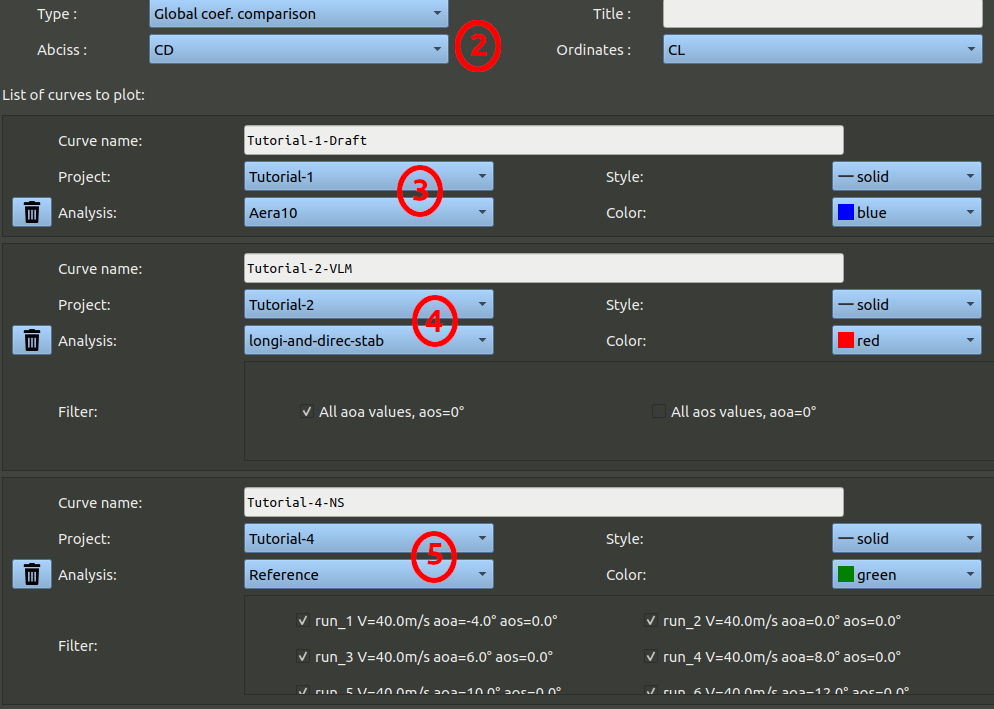
Let's have a look at the results and check they are of the order expected. One thing that can be done is to compare the polar obtain by this results to the polar curve obtained in turotial-1 and in tutorial-2, as it always represent the same aircraft, bu modeled with different techniques.
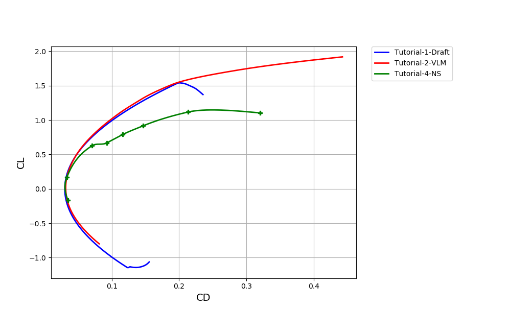
We note that past the maximum L/D point, the Lift on the NS_3D project is significantly lower than for the other models. There might be a problem.
Let's check what is happening on the 12° angle of attack.
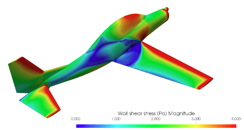
You should get the following image. Green zones indicate a high air velocity attached to the surface. Pink areas corresponds either to very low velocities (stagnation points) or to a flow separation away from the surfaces (stall). Here we can see a large separation appearing on the wing root.
Then, with the image selection combobox, select "Solution-yPlus-TQ3.jpg" near the bottom of the list.
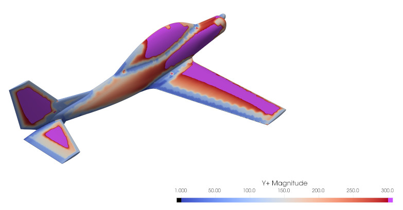
Y+ are a kind of Reynolds number computed inside the cells connected to the surface. It can indicate if the mesh is sized correctly relatively to the local air velocity. For instance, pink zones indicate parts of the mesh that are meshed too coarse, outside of the bounds considered valid for the turbulence modeling. We purposely did that since this is a tutorial and we want it to run fast for demonstration purpose. But if this was a real study, we would need to decrease the details size of the project, or create refinement areas, in order to remove the pink areas that can be seen here, so that the mesh can be considered of good quality, even if it increases processing time.
Draft and VLM cannot predict this kind of separation. Here this is a design flaw: the shapes at the wing-fuselage junction are creating a very early stall on the root.